Manufacturer · Fashion Accessories



Good clothing label design starts from the real size: a label is a few centimetres wide, so the logo must be simplified, the type large enough and the colours contrasting. The file is prepared in vector format, colours are specified as Pantone, and margins and a seam allowance are left around the logo. The technology – weaving, printing, leather or board – determines which details are possible.
Label design: start from the real scale
The most common mistake is a design made on a large screen. A logo that looks great at 30 cm wide loses detail at 4 cm. So right from the start set the artboard to the label's real size in millimetres and review the design at 100% scale. Print it on paper and place it on the garment – this is the fastest test of proportions and legibility.
File format
- Vector files – AI, EPS, PDF or SVG. They allow precise scaling and are used directly for the weaving program, printing plate or die.
- Convert fonts to outlines so that the typeface is not substituted when the file is opened on another computer.
- Raster files (PNG, JPG) are useful as a visual reference but are not enough for precise production.
- Also send a PDF with dimensions – marking width, height and seam allowance.
Typeface and minimum text size
Legibility depends on the technology. On woven labels the letters are built from threads, so very thin serifs and small letters "blur". Printing on satin or taffeta allows smaller text, but it must still be readable without a magnifying glass.
- Prefer typefaces with clear shapes and an even line weight.
- Avoid very thin (light, hairline) weights for small text.
- Do not tighten letter spacing – on a label the letters merge.
- For the care label, choose a simple sans-serif typeface for maximum legibility.
Exact minimum values depend on the weaving density and print method – ask the manufacturer for a recommendation for your type of label.
Colours
The colour on screen (RGB) and the colour of the thread or ink never match exactly. So specify colours as Pantone or send a physical colour sample. With woven labels the number of colours affects both price and appearance: two or three colours give a clean, elegant result. Printed labels offer a more flexible range.
Contrast
Contrast matters more than shade. A dark background with a light logo, or vice versa, reads clearly. Two close colours – such as navy on black – merge, especially under the weak lighting of a fitting room.
Metallic effects
Gold and silver threads or foil add a luxurious accent but make the label stiffer. Use them on hang tags and labels for outerwear, not on lingerie.
Margins and seam allowance
Leave free space around the logo so it can "breathe". With a folded label, part of it goes into the seam – usually a few millimetres on each side, depending on the fold. No text or important element should fall into this zone. Ask the manufacturer exactly how much seam allowance the chosen fold requires and mark it in the design.
Specifics by label type
| Type | What works well | What to avoid |
|---|---|---|
| Woven | Clear outlines, solid letters, 2–4 colours | Gradients, photographs, very small text |
| Printed | Fine detail, more text, symbols | Too little contrast between tape and ink |
| Leather | Simple logo, embossing, foil | Many small details, thin lines |
| Board | Full-colour graphics, finishing | Text too close to the cutting edge |
For the technical possibilities, see our woven labels, and for swing tickets our hang tags.
Designing the care label
The care label is informational, so here design serves legibility. Arrange the information logically: composition by part, care symbols in one row, manufacturer details and style number. On a multilingual label, group the languages consistently and use language codes if needed. The label length grows with the number of languages – plan for it in advance.
Designing the hang tag
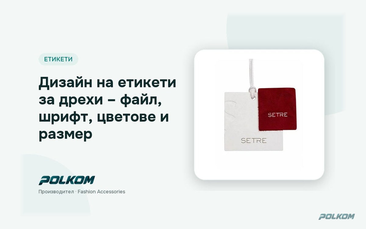
A hang tag has more space and can tell the brand's story. On the front – logo and minimal text; on the back – style, size, price, barcode or QR code. Leave a margin around the hanging hole and at least a few millimetres from the cutting edge, because the die has a small tolerance. If you use embossing or foil, supply them as a separate layer in the file.
Who does the design
If you have a logo and an identity, the technical adaptation for a label is usually done by the manufacturer. If you are starting from scratch, work with a designer, but give them these guidelines – size, technology, number of colours – right at the start. The cost of design depends on the amount of work: adapting a ready logo is a small step, while creating a new identity is a separate project.
Checklist before sending
- Artboard at the real size in mm.
- Vector file, fonts in outlines.
- Colours as Pantone.
- Seam allowance and fold marked.
- Spelling and composition percentages checked.
- Test with a 1:1 printout on the garment.
You will find all types of labels in our clothing labels category.
Send your design to Polkom
Polkom is a Bulgarian manufacturer of sewing accessories from Sofia with over 30 years of experience. We technically adapt your design for weaving, printing, leather or board, send a visualisation and make a fast sample. We deliver throughout the EU. Send the file via our inquiry form – you will receive feedback and a proposal. Minimum quantities depend on the article.