Manufacturer · Fashion Accessories



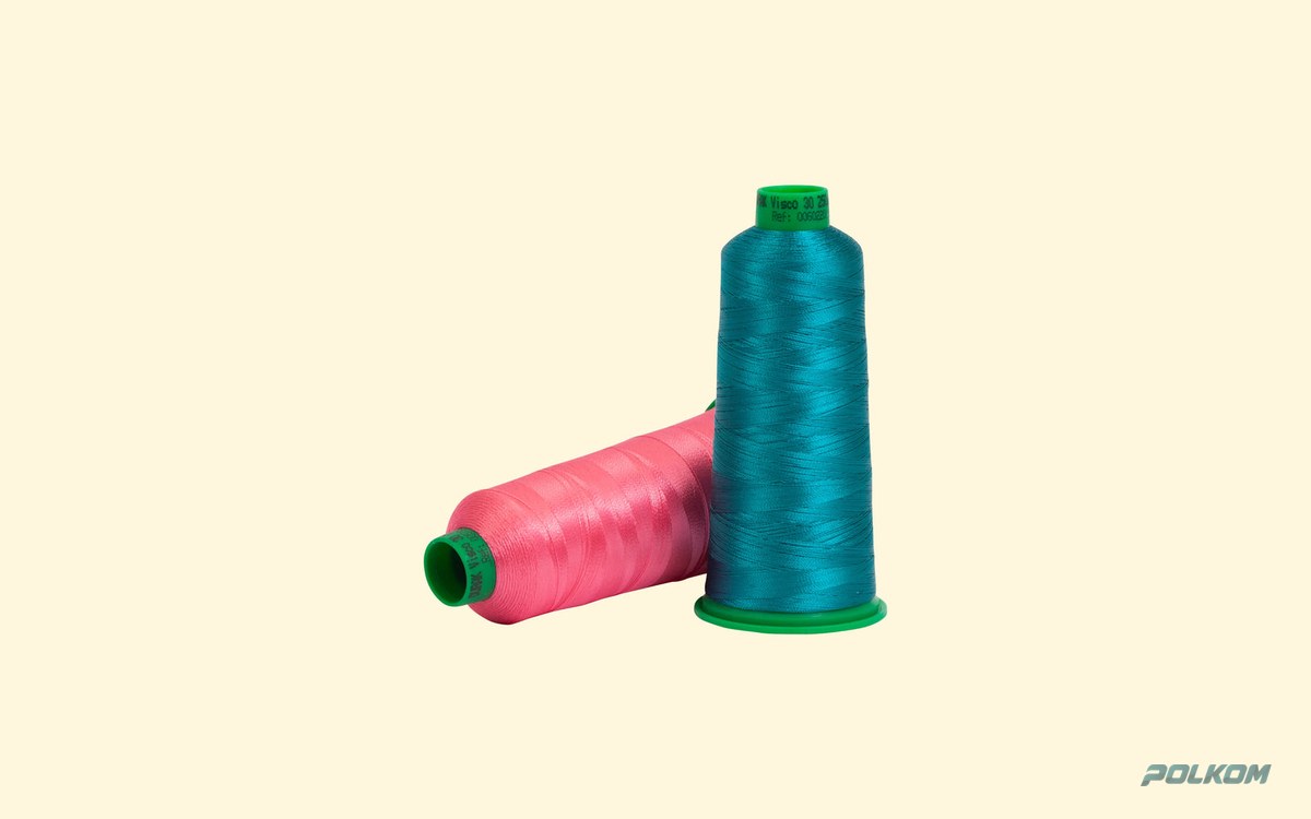
An embroidery thread colour card is a catalogue of real thread windings or samples arranged by colour number. It lets you choose the exact shade in real life rather than on screen, and record it by number so you can reorder it without deviation. For corporate logos, the colour is usually specified with a Pantone code and the closest number on the colour card is selected, then confirmed with a sample on the actual fabric.
Why an embroidery thread colour card rather than a photo
A computer or phone screen displays colour in RGB, and a printer in CMYK. Neither corresponds exactly to dyed thread. In addition, embroidery thread has a sheen: the same strand looks lighter at an angle and darker in shadow. That is why choosing a colour from a photo or PDF almost always leads to a difference between expectation and the actual embroidery.
The colour card contains real thread from the same production. Under good light you can see the shade, the sheen and how the colour sits next to neighbouring tones.
How a colour card is organised
- Colour number – a unique code for each shade within the article. This is the most important thing you record.
- Colour groups – whites and creams, yellows, oranges, reds, pinks, purples, blues, greens, browns, greys and blacks.
- Separate cards per article – viscose (rayon), polyester and metallic threads usually have their own cards. The same number in different articles does not necessarily mean the same colour.
- Special series – neon, pastel, variegated, glow-in-the-dark.
Matching the colour to Pantone
Pantone is a colour system used by designers. For textiles, Pantone TCX/TPX (Fashion, Home + Interiors) is mainly used, and for print Pantone Coated/Uncoated. If you only have the print code from your logo, bear in mind that it was not created for textiles.
- Send the Pantone code and, if possible, a physical reference – fabric, printed material or a previous embroidery.
- You receive a proposal for the closest number from the colour card of the chosen article.
- Check the sample in daylight and under the lighting in which the garment will be sold.
- Approve and record the number. Include it in the model's technical specification.
A perfect match is not always possible, because the thread palette is limited and the sheen changes perception. The aim is a visual match in real conditions, not identical numbers.
Mistakes when choosing a colour
- Choosing under poor lighting. Yellowish light in the factory distorts blue and grey tones. Look at the card in daylight or under a lamp with neutral light.
- Comparing thread with thread, without fabric. The colour of a thread is perceived differently on a black, white or coloured background. Navy on black can look almost black.
- Shades that are too close in one design. Two very close tones merge from a few metres away. If the logo must be legible from a distance, contrast matters more than the exact shade.
- No recorded number. For a repeat order, "the same blue" is not a specification.
- Changing the article. When switching from viscose to polyester, choose the shade again from the new article's card.
How to build a brand palette for embroidery
If you work with a brand that embroiders its logo on different products, create one colour table that applies to all suppliers and all series:
| Logo element | Pantone | Thread article | Colour number | Background |
|---|---|---|---|---|
| Main colour | (code) | Polyester No. 40 | (number) | White, grey |
| Main colour – variant | (code) | Polyester No. 40 | (number) | Dark |
| Accent | (code) | Metallic | (number) | All |
It is good practice to provide a separate colour variant for dark backgrounds – the same shade often looks darker and loses contrast on black or navy.
How to store the colour card
A colour card is a working tool and also changes over time. Light bleaches the windings and fingers leave grease on the thread. Keep the card closed, away from windows, and replace it periodically if it is used daily. For approved brand colours, it is useful to keep a separate "golden sample" – an embroidered piece with the approved threads, against which you compare every subsequent series. Note the date, article and colour numbers on the back of the sample.
Dye lot
Even with the same colour number, different dye lots can have minimal differences. With a small logo this is practically unnoticeable. With large, dense embroidery on a set of uniforms, it is best to sew the whole series with thread from one dye lot, or at least not to mix lots within one product.
Embroidery colour and the other accessories
An embroidered logo is rarely on its own. The brand colours are also present in woven labels, printed labels and the sewing threads used for decorative stitching. When all these elements are selected against the same Pantone code, the whole garment looks finished. You will find embroidery threads in a wide colour palette in the embroidery threads category.
Colour selection with Polkom
Polkom is a Bulgarian manufacturer and wholesaler of sewing accessories with over 30 years of experience. We select embroidery thread colours to Pantone or to a reference, suggest the closest shade and send samples so you can approve the colour in real life. We can also coordinate the colours of the brand's labels and other accessories. We deliver across the EU, and minimum quantities depend on the article. Send an inquiry via our Contact page.