Manufacturer · Fashion & Home Accessories




A good logo for buttons is in vector format (AI, EPS, PDF or SVG), single-colour, with fonts converted to curves and with lines thick enough to stay legible at diameters of 10 to 25 mm. Simple marks, monograms and short lettering work best; complex logos with many details are usually simplified specifically for buttons.
Why a logo for buttons is different from a logo for print
A brand's logo is usually designed for a website, a business card or a label – media that have space and colour. A button is a small, sometimes curved surface, and the logo is applied with a laser or a mould in one tone. So a design that looks excellent on screen can turn into an unclear blob on a 15 mm button. File preparation is where it is decided whether the end result will be clear and elegant.
File format
| Format | Suitable? | Comment |
|---|---|---|
| AI, EPS | yes | the standard for engraving and moulds |
| PDF (vector) | yes | if exported from a vector program |
| SVG | yes | convenient and universal |
| PNG, JPG | conditionally | only at high resolution; requires redrawing |
| Photo or sketch | as a start | can be redrawn, but this lengthens the process |
If you only have a raster image, send the largest version available. The logo will have to be vectorised, and you will need to approve the result before engraving.
Technical rules for a button logo
One colour
Engraving and relief are single-colour. If your logo has gradients, shadows or several colours, prepare a monochrome version – solid black areas on a white background only. Colour is achieved later by filling the grooves or with enamel, but each colour is a separate area that must be clearly defined.
Line thickness
Thin lines are the most common cause of a poor result. As a guide, lines and the spaces between them should be at least 0.2–0.3 mm for laser on dense materials and more for porous materials and relief. If the logo has thin accents, thicken them in the button version.
Fonts as curves
Convert all text to outlines. Otherwise the software may substitute another font and the lettering will look different.
No frame or background
Do not place the logo in a square or rectangle unless it is part of the mark. A button is round and the frame will be cut off or look accidental.
How large the logo should be relative to the button
A practical rule is for the logo to take up about 50–70% of the button's diameter if it is in the centre and there are no holes. On two- or four-hole buttons the logo is placed around them or above and below them, and the free area is considerably smaller.
| Button size | Approx. mm | Logo recommendation |
|---|---|---|
| 16L–18L | 10–11.5 | mark or initials only |
| 20L–24L | 12.7–15.2 | mark or short lettering |
| 28L–32L | 17.8–20.3 | mark and brand name |
| 36L–44L | 22.9–27.9 | full logo, including circular lettering |
The mm values are calculated using the standard 1L = 0.635 mm.
How to simplify a complex logo
- keep only the mark without the name, or only the name without the slogan;
- remove thin decorative lines and shadows;
- increase the spacing between letters;
- use initials or a monogram for the smallest buttons;
- prepare two or three versions – for large, medium and small sizes.
Many brands use the full logo on coat buttons and only the mark on cuff buttons. This keeps the look unified while every button stays legible.
Placement and orientation
State whether the logo should be centred, whether it has a direction (for example lettering that must sit horizontally) and how it relates to the holes. With shank buttons the position is easy to fix, while with buttons with holes symmetrical round marks are a safer choice, because they look good regardless of the angle at which they are sewn on.
The logo and the material
The same file looks different on different materials. On corozo the laser gives a warm brown outline with good contrast, on dark polyester the logo is lighter and more discreet, and on metal buttons the relief creates a play of light and shadow. If contrast is important, the grooves can be filled with colour. That is why you should always look at the sample on the real material, not just the visualisation.
The logo on buttons with holes
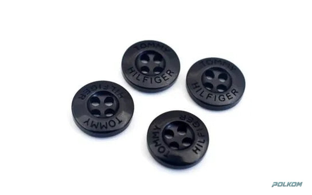
On two- or four-hole buttons the central area is taken. There are several possible solutions: a small mark above the holes, lettering in a circle around them, a logo on the wide rim (on rimmed buttons) or engraving on the back when the brand wants a discreet detail. Each option requires a different version of the file. If you want circular lettering, prepare it as text on a circle with a precisely set diameter – otherwise the letters may end up too close to the edge or the holes.
The most common file problems
- Hidden objects and layers – invisible elements in the document are sometimes engraved together with the logo.
- Open paths – lines that are not closed cannot be filled correctly.
- An object with an outline instead of a fill – the stroke must be converted to a solid shape.
- Wrong scale – the logo is prepared at a size different from the real one and the proportions are lost.
- Too many anchor points – an auto-traced logo with jagged edges looks uneven after engraving.
If you are not sure, send the file as it is – we will review it and tell you what needs correcting.
Checklist before sending
- Vector file, single-colour, fonts as curves.
- Minimum line thickness checked at the real size.
- Versions for the different button sizes.
- Instructions on position, orientation and desired logo size in mm.
- Fill colour, if any.
Send your logo to Polkom
Polkom is a Sofia-based manufacturer of garment accessories with more than 30 years of experience. We review every file, suggest corrections if the logo is too detailed and make a sample of engraved buttons on the chosen model. Send your logo and a description of the garment via our contact page.