Manufacturer · Fashion & Home Accessories




A zip's colour looks different under different light because the tape and the fabric are coloured with different dyes, which reflect light in different ways. Under one lamp the two materials look the same, under another they look different. This phenomenon is called metamerism. To avoid it, compare the zip with the fabric under at least two light sources – daylight and the lighting in the shop.
Zip colour under different light – what happens
The eye does not see the "colour" of a material, but the light it reflects. Every source – the sun, an incandescent bulb, a fluorescent lamp, an LED – emits a different combination of wavelengths. If two materials reflect light in the same way at all wavelengths, they look the same everywhere. If, however, they achieve the same visible colour with different "recipes", they match only under certain light.
With zips this is almost unavoidable: the tape is usually polyester and is dyed with disperse dyes, while the fabric may be cotton, wool or a blend dyed with completely different dyes. So the "navy" of the zip and the "navy" of the fabric are never chemically identical.
Typical situations in practice
- Perfect in the factory, not in the shop. The factory is lit by one lamp, the shop by warm LED light that brings out other shades.
- Beige turns grey or pink. Beige and grey tones are particularly sensitive.
- Navy looks purple or green. Under artificial light, navy and black often diverge.
- The customer complains about photos. Flash and photo processing exaggerate the difference.
Standard light sources
In the textile industry, colour is assessed under standardised sources, usually in a light booth. The most widely used are:
| Source | What it simulates | When it is used |
|---|---|---|
| D65 | Average daylight | Main source for colour approval |
| TL84 | Shop fluorescent lighting | Checks for retail outlets, especially in Europe |
| CWF | Cool white fluorescent light | Offices and shops, often for the US market |
| A | Incandescent bulb (warm) | Checks for home lighting |
| UV | Ultraviolet light | Detecting optical brighteners |
If you work with a brand, it usually specifies which sources are mandatory for approval – most often D65 as the primary source and one secondary.
How to compare zip colour correctly
- Place the tape on the fabric, not next to it.
- View at an angle of about 45°, without glare.
- Use a light booth if you have one; if not – daylight from a north-facing window, without direct sun.
- Check under a second source – the shop lighting or warm home lighting.
- Swap the positions of the samples – left and right – to rule out the influence of the angle.
- Judge quickly – after prolonged viewing the eye adapts and differences disappear.
How to reduce metamerism
Metamerism cannot be eliminated completely, but it can be minimised:
- approve the colour under the brand's main source and check under at least one more;
- if there is a large discrepancy under the secondary source, choose another number from the colour card that is more stable;
- avoid approval under a single light source in the factory;
- for critical colours – beige, grey, olive, navy – request a zip sample and check it under your conditions;
- with invisible zips, where only a thin line is visible, a darker shade hides differences better.
The role of the colour card
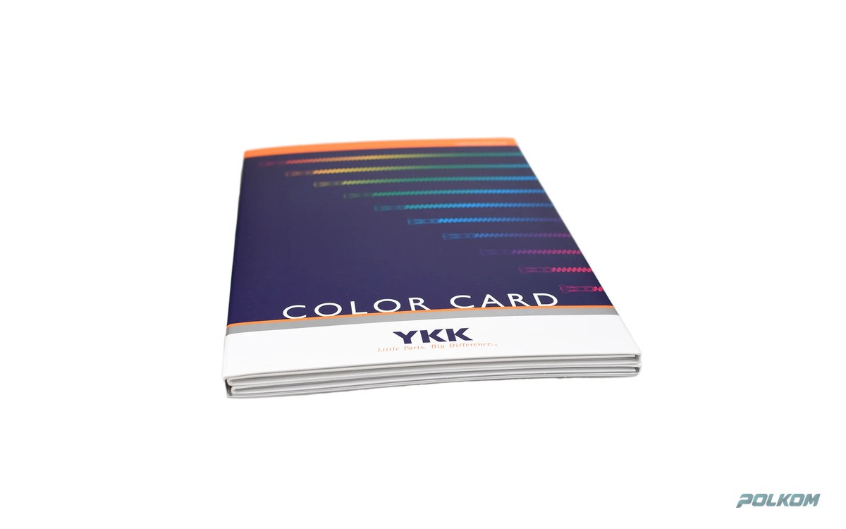
The YKK colour card contains real tape samples. This means that when you compare the card with the fabric, you see exactly the metamerism effect the finished zip will have – something a photo or printed palette cannot show. That is why the card is the most reliable tool for choosing. You will find more about it on our YKK zip colour card page.
Sheen and texture also change colour
Besides light, colour perception also depends on the surface. Zip tape is dense and slightly shiny, while the fabric may be matt, with a fibrous or pile surface. A shiny surface reflects more light and looks lighter at certain angles, while a matt one looks darker and more saturated. That is why velvet, fleece or woollen fabric almost always looks darker than a tape in the "same" colour. In practice this means that with pile and matt fabrics you often need to choose a number that is slightly darker than the fabric when viewed on the card. Look at the samples from different angles too, as the garment will move when worn.
Photos and screens
The colour in a photo depends on the camera, white balance, processing and the screen on which it is viewed. Two photos of the same zip under different light can look like two different colours. So never approve a colour from a photo and do not send photos as the main reference. If you do need to show a colour remotely, photograph the zip and fabric together, in daylight, with a grey or white reference in the frame – and use the photo for orientation only.
Particularly sensitive products
Metamerism is most noticeable on:
- formal dresses and suits with invisible zips – see YKK invisible zips;
- products sold in shops with warm, "atmospheric" lighting;
- collections in neutral tones – beige, grey, khaki;
- products photographed for an online shop.
Advice and ordering
Polkom is a Bulgarian manufacturer of garment accessories and a supplier of original YKK zips. If you have a difficult colour where the zip and fabric do not match, send us a fabric sample – we will suggest a number from the YKK card and a zip sample for you to check under your conditions.