Manufacturer · Fashion & Home Accessories


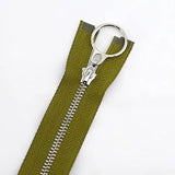


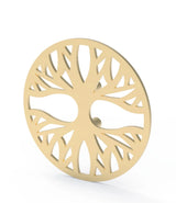
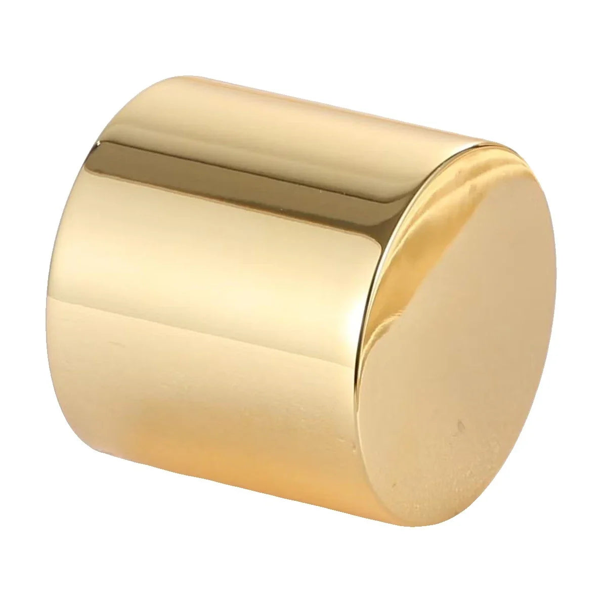
A perfume logo is usually placed in three places: on the bottle (with a metal label, printing or engraving on the glass), on the cap (engraved, raised, with enamel or with an inset metal medallion) and on the box (with foil, embossing or printing). The strongest effect comes when the three places “talk to each other” – one logo, one metal colour and a clear decision about which place carries the main mark.
Where to place the perfume logo
Before choosing a technique, decide on the hierarchy. Most brands use one main place for the full logo and one or two secondary places for a symbol, monogram or initials. If the full logo is everywhere, the bottle looks like an advertising sign rather than a luxury object.
| Place | Techniques | What it achieves |
|---|---|---|
| Front of the bottle | Metal label, printing on the glass, engraving or frosting of the glass, transparent label | Main recognition on the shelf and in photos |
| Top of the cap | Engraving, relief, debossed logo, enamel, inset medallion | A detail seen from above and felt with every use |
| Side of the cap | Engraved lettering, raised line, small symbol | A discreet signature on bottles with tall caps |
| Box | Hot foil stamping, embossing, spot UV varnish, Pantone printing, metal plate | The first impression and recognition as a gift |
| Extras | Logo ribbon, hanging medallion, paper bag, tissue paper | A complete unboxing experience |
Logo on the bottle
Metal label
The metal perfume label is the most dimensional and luxurious option. The plate can be rectangular, oval, with a cut-out outline or curved to the radius of the bottle, in any metal colour. It carries the logo raised, debossed, engraved, with enamel or printed, and is often the only element on the front of the bottle.
Printing and decoration of the glass
Screen printing and other types of printing on glass, as well as frosting and engraving of the glass itself, are done when the bottle is decorated. They give a flat, integrated look. It is important to match the colour of the print to the metal of the cap – gold printing next to a silver cap rarely looks intentional.
Transparent or paper label
An economical option for samples, testers and trial runs. In the main line it usually gives way to metal or direct decoration, but it remains a convenient carrier of the mandatory information on the bottom of the bottle.
Logo on the cap
The cap is the element the customer holds every day. That is why the logo on it should be felt, not just seen.
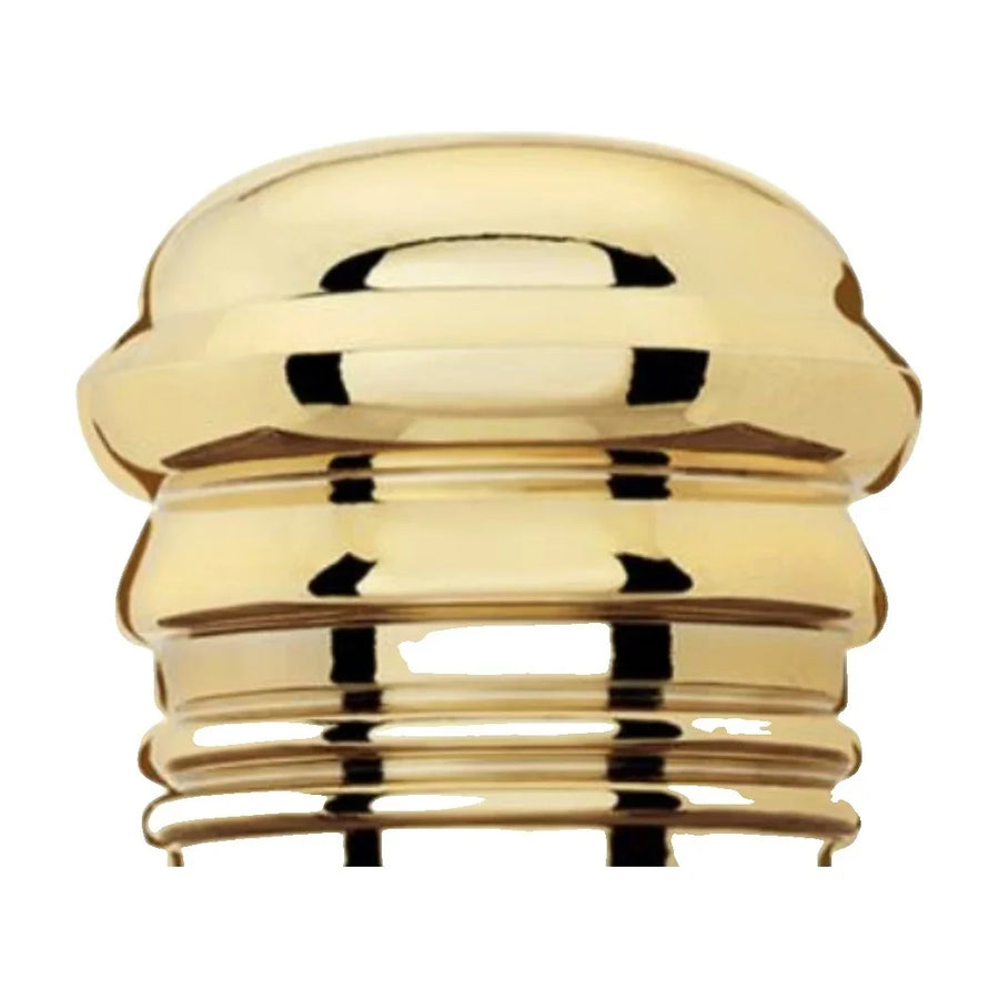
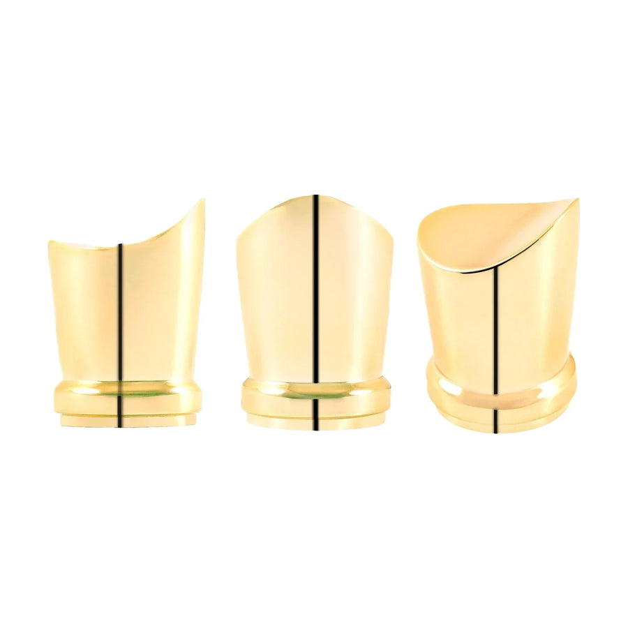
- Metal cap – the logo is engraved, cast as a raised or recessed relief, filled with enamel or printed. Browse the metal perfume caps – they are made in any size, shape and metal colour.
- Polyester cap – the logo can be moulded into the material, engraved or printed, and a metal medallion can be inset for contrast. The colour of polyester caps follows Pantone – solid, mixed, marble, matte or glossy.
With a logo on top of the cap, think about orientation: if the cap rotates when it is put on, the logo may end up crooked in relation to the bottle label. A round monogram or a symbol without direction solves this problem.
Logo on the box
The box is the first thing the customer sees in the shop, and the only thing they see with an online order before unboxing. The most widely used techniques are:
- hot foil stamping – gold, silver, rose gold or coloured foil;
- embossing or debossing, alone or combined with foil;
- spot UV varnish – a glossy logo on a matte background;
- full-colour Pantone printing;
- a metal plate on the lid of a rigid box – the same as the bottle label, but larger.
You will find all formats and finishes in the perfume and cosmetics boxes category.
How to maintain a consistent look
- One metal colour – the cap, the metal label and the box foil in one tone. If the cap is rose gold, the foil should also be rose gold.
- One version of the logo for each size – the full logo for the box and label, a simplified symbol for the top of the cap.
- Consistent proportions – the logo on the box should not be much larger than the one on the bottle, otherwise the product looks smaller when opened.
- A sample of all elements together – colours are approved only when the cap, label and box are side by side.
Logo on the extras
Besides the three main places, the logo can also appear on the details around the product. A satin ribbon with a printed name closes the gift box, the paper bag carries the brand outside the shop, and tissue paper with a repeated symbol makes an online order more personal. A metal medallion hanging on a cord around the neck of the bottle is a good way to add the logo without changing the bottle itself – for example for a limited or holiday edition. These elements work best when they repeat the colour and the simplified symbol from the cap rather than the full logo.
Common mistakes when placing the logo
- The same full logo everywhere – the bottle loses elegance; use a symbol in the smaller places.
- A complex logo at a small size – fine lines disappear in relief and enamel; prepare a simplified version.
- Different shades of gold – cap, label and foil from different sources without a joint proof.
- A directional logo on a rotating cap – the lettering ends up crooked relative to the label.
- Deciding without a sample – approval only on screen, where metal looks completely different.
How to prepare the logo for production
- A vector file (AI, EPS, PDF or SVG) with text converted to outlines.
- A single-colour version – for engraving, relief and debossed logos the colours do not matter; the outline does.
- A simplified version for small sizes – without fine lines and small text.
- Pantone codes for enamel, printing and polyester caps.
- A photo or drawing of the bottle and the preferred metal colour.
Polkom – your perfume logo from one place
Polkom is a Bulgarian manufacturer of perfume accessories – metal and polyester caps and metal labels – as well as packaging and boxes. We produce any kind of logo: raised, debossed, engraved, with enamel or printed. Because the cap, the label and the box are made by one partner, the colour and the logo match across all elements. All our metal products are nickel free. Minimum quantities depend on the article – send an inquiry via Contact.