Manufacturer · Fashion & Home Accessories
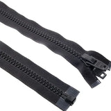
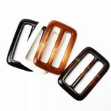
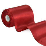
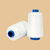
Garment accessories in the fabric colour are most reliably achieved when all components – zips, buttons, threads, ribbons, elastics and labels – are matched against the same physical fabric sample, under the same standard lighting and with a common colour reference, such as Pantone TCX. Different materials absorb dye differently, so exact matching is a goal, while the real criterion is an agreed tolerance. Here is how to organise the process for the entire collection at once.
Why garment accessories in the same colour look different
- Different materials. Polyester tape on the zip, nylon coil, polyester button, cotton thread and satin ribbon are dyed with different dyes and under different conditions.
- Different surface. A glossy button appears lighter than a matte fabric of the same colour; ribbed grosgrain ribbon looks darker than smooth satin.
- Metamerism. Two colours match in daylight but differ under store lighting because they are made with different dyes.
- Size. Thin thread or a small button looks lighter than a large fabric area.
One reference for the entire collection
Choose a main reference for each colour in the collection and use it for all manufacturers:
- Physical fabric sample – the most accurate reference, as it shows the actual garment colour.
- Pantone TCX or TPG – Pantone’s textile and paper colour cards for fashion; useful as a common language but a reference, not a fabric substitute.
- Supplier colour card – for example, a card for zips or threads; the fastest way if a standard colour is close enough.
Do not mix systems: Pantone C (Coated) is for printing on paper and inks and does not directly correspond to textile codes.
Lighting and approval method
Colour is evaluated in a light box with standard light sources:
| Source | Simulates |
|---|---|
| D65 | Daylight – main approval source |
| TL84 or TL83 | Store fluorescent lighting |
| A | Warm incandescent lamp |
| UV | Optical brightener check |
Check the accessory against the fabric under at least two sources. If it matches under D65 but differs under TL84, you have metamerism – discuss it with the manufacturer. Larger brands measure colour with a spectrophotometer and express difference as ΔE (e.g. CMC 2:1 formula) against an agreed tolerance.
Zip in the fabric colour
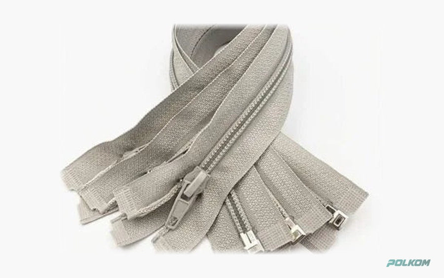
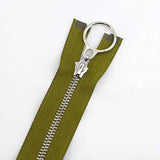
A zip has three elements: tape, coil and slider. For coil zips, the tape and coil are dyed but can differ slightly. For metal zips, teeth and slider are plated (nickel colour, old gold, antique), while the tape matches the fabric colour. For invisible zips, only the tape and puller are visible – these are critical. Send the manufacturer a fabric sample and specify which element is critical. See types in the zips category.
Buttons in the fabric colour
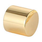
Polyester buttons are coloured during moulding and can be made in almost any colour from a sample. Decide if you want exact matching, one tone darker, or contrast. For effects – marble, horn, mother-of-pearl – matching is assessed by the main tone. Natural materials like corozo are dyed but retain slight variations. More details in polyester buttons.
Threads: colour and stitch
Thread in the stitch looks lighter than on the spool because it is thin and lets light through. Therefore, for tone-on-tone matching, a shade slightly darker than the fabric is usually chosen. For decorative contrast stitching, select the colour based on buttons and metal accessories. Threads are chosen from the manufacturer’s colour card – request a spool or card sample, not just a code.
Pantone colour for labels
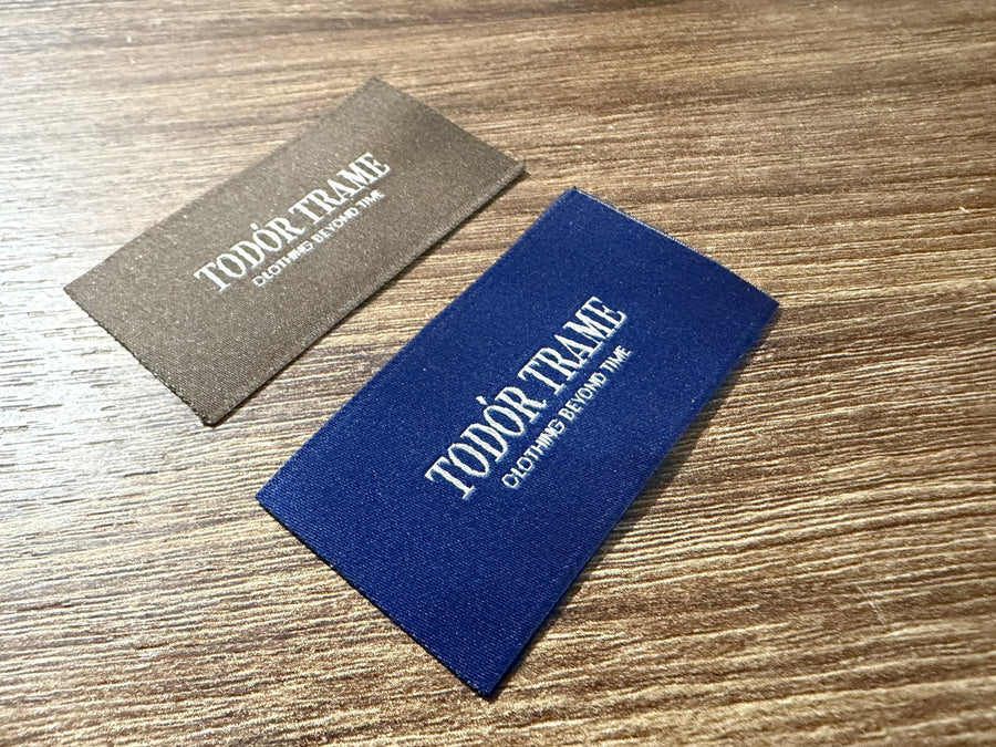
- Woven label – colour is thread colour; choice is from available threads closest to Pantone. Woven colour is slightly darker and richer than printed.
- Printed label – ink is mixed by Pantone, but the base (white, black, ecru satin) affects the final tone.
- Leather label – leather colour naturally varies; agree on a range.
- Cardboard label – Pantone C printing on cardboard, controlled by print proof.
Ribbons, elastics and cords
Binding ribbons, waist elastics and hood cords are often visible and must match the fabric or zip. Include them in the same colour session. Elastics contain elastomer yarn that sometimes absorbs dye differently – check samples stretched and unstretched.
Batches and reorders
Even approved colour can vary slightly between batches – for fabric and accessories alike. For reorders, send the manufacturer the approved standard, not the new fabric batch, unless the fabric tone visibly changed. If fabric is from a new batch with a different tone, make a new colour sample for accessories. Ask the manufacturer to mark each package batch and avoid mixing batches in one model – differences are most visible when buttons or zips are side by side on the shelf.
Process for the entire collection
- Collect physical samples of each fabric in the collection.
- Send them to manufacturers with a list: which accessory, which element, what matching (exact, one tone darker, contrast).
- Receive colour samples of all accessories.
- Approve them together in a light box next to the fabric.
- Keep signed standards with you and the manufacturer.
Working with one manufacturer for multiple accessory groups shortens this process – one fabric shipment, one approval session.
Colour matched accessories by Polkom
Polkom is a Bulgarian manufacturer and wholesaler of accessories for fashion, furniture, footwear and bags from Sofia with over 30 years of experience. We match zips, buttons, threads, ribbons and labels to your fabric sample or Pantone, produce them with your logo and deliver across the EU. Explore the accessories category and send your fabric samples via the contact form.