Manufacturer · Fashion & Home Accessories

Contents
Thread colour is chosen by unwinding a few centimetres of thread and placing it on the fabric in daylight. If there is no exact match, choose a shade slightly darker than the fabric – in the seam the thread looks lighter than on the spool. For patterned fabrics, match the dominant colour, and for visible decorative stitching the colour is a design decision.
Basic rules for thread colour
- Compare with a single strand, not the spool. Wound thread looks darker and more saturated.
- Prefer the darker shade. A single strand in the seam reflects light and looks lighter.
- Check in daylight. Artificial lighting in the factory distorts tones, especially greys, beiges and navies.
- Look at the back of the fabric too, if it will be visible – on reversible styles, curtains, scarves.
- Take sheen into account. Filament thread is shinier and looks lighter than spun thread in the same colour.
Metamerism: why the colour "changes"
Two materials can look the same under one light and different under another. This phenomenon is called metamerism and is a common cause of complaints: the thread matches the fabric in the factory, but in the shop or on the street the seam stands out. That is why for important orders you should check the colour under at least two sources – daylight (D65) and warm shop lighting. Professional factories use a light booth for colour comparison.
How to choose thread colour for different fabrics
Plain fabrics
Look for the closest possible shade. If in doubt, choose the darker one. With very light pastel colours, where a darker thread would stand out, take a neutral shade of the same lightness.
Patterned and multicoloured fabrics
Choose the colour that dominates the pattern, or a neutral tone that blends with the background. On checked and striped fabrics, thread in the colour of the darker stripe is usually the least noticeable.
Melange and textured fabrics
For melange (grey, blue, beige melange), choose the middle tone between the light and dark fibres. A grey thread slightly darker than the overall impression is a safe choice.
Sheer and thin fabrics
On chiffon, tulle and organza the thread shows through the fabric, so the match must be exact. For very colourful sheer fabrics, consider clear thread.
Denim
On jeans the decorative seams are traditionally in contrasting tones – mustard, copper-orange, beige – while the inside seams are blue or a neutral colour. This is a style decision that must be recorded in the specification.
Contrast and decorative stitching
Contrast stitching emphasises the lines of a style and is a recognisable element of many brands. For it to look good:
- use a thicker thread (ticket 40, 30 or 20) with a longer stitch;
- test it on straight and curved sections – irregularities show immediately;
- coordinate the colour with the other accessories: buttons, zips, labels;
- check colour fastness in the wash so that it does not stain light fabric.
Colour matching in series production
In series sewing, the thread colour should be recorded by a number from the manufacturer's colour card or by a Pantone reference, not with words such as "navy". It is good practice to keep the fabric sample and the approved thread together in the style's tech pack. With a new fabric batch the colour is checked again – dyeing variations between batches are normal and sometimes require a different thread shade.
| Situation | Recommendation |
|---|---|
| No exact shade | half to one shade darker |
| Patterned fabric | dominant colour or background tone |
| Melange | the middle tone, slightly darker |
| Many shades of white | optical white only with optical white fabric; natural white with ecru |
| Black | check that the fabric is not navy or graphite |
White and black threads are not all the same
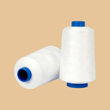
White thread can be optical white (with an optical brightener, with a bluish cast) or natural, without brightener. Optical white thread on ecru fabric looks bluish and stands out sharply. Black thread also has shades – bluish, brownish or neutral black. On black fabrics of different fibres, do a test: black polyester and black cotton rarely look the same.
Colour fastness
Choosing the colour is only half the job. The thread must keep its colour through washing, rubbing and sunlight and must not stain the fabric. Polyester threads have very good fastness; with deep reds, navies and blacks in cotton threads, it is wise to do a wash test before sewing light fabrics.
When colour does not matter
For inside seams covered by a lining, many factories work with a limited set of neutral colours to reduce stock. This is a sensible economy, but do not apply it to sheer fabrics, unlined jackets and garments customers wear open.
Thread colour and the other accessories
A good style looks coherent when the thread, buttons, zip, labels and ribbons are coordinated. On garments with contrast stitching it is a good idea to repeat the thread colour in one more detail – for example in the button loops or the zip tape. That way the contrast looks like a deliberate design decision rather than a random choice.
Thread colours from Polkom
Polkom offers threads in a wide colour range for series production and ateliers. We can match a shade to a sample of your fabric – send us a swatch or a Pantone reference. For decorative effects and logos, see also the embroidery threads, and for general sewing – the sewing threads. Inquiries and samples – via the contact page.
Share this article