 Manufacturer · Fashion & Home Accessories
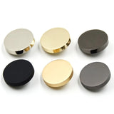

Buttons in the colour of the fabric are easiest to achieve with polyester, because the resin is dyed in the mass to a fabric swatch or a catalogue colour code, for example Pantone TCX. The technician selects the pigments, casts a test sheet, compares it with the fabric under standard light and adjusts the recipe. Final approval is always on a physical sample, because the sheen, translucency and profile of the button change how the eye perceives the colour.
Why polyester is best for colour to sample
Natural materials such as horn, mother-of-pearl and bone have their own colour, which can only be adjusted. Metal buttons depend on the electroplated finish and the lacquer. Polyester resin, by contrast, is a colourless base into which almost any tone can be mixed – solid, pastel, saturated, translucent or with a pearl sheen. That is why, when a collection needs a button in exactly the tone of the fabric, the first choice is polyester buttons.
Buttons in the colour of the fabric: how the colour is specified
To a fabric swatch
The most reliable way. Send a piece of the actual fabric at least the size of a palm. Small clippings do not show the tone well, and photos are inaccurate because of screen and camera settings.
To Pantone or another colour catalogue
Convenient when the fabric has not yet been produced or when the brand has corporate colours. For textiles, the textile palettes (TCX, TPG) are used, which differ from the print palettes. State the code and, if possible, send the physical card.
To our colour card
For standard tones – black, white, navy, grey, beige – you can choose from the colours available in stock, which saves time.
Why the button looks different from the fabric
Even with a perfectly matched pigment, the button and fabric can look slightly different. The reasons are physical:
- Sheen. A glossy button reflects light and looks lighter, a matte one darker and more saturated.
- Translucency. Translucent buttons let light through, and their tone depends on the fabric beneath.
- Fabric texture. Velvet, wool and tweed absorb light, while satin reflects it.
- Metamerism. Two colours that match in daylight can diverge under shop lighting.
- Profile. The rim and recess of the button create shadows that change perception.
How colour matching works
- Receiving the sample – fabric, Pantone code or both.
- Selecting a recipe – the technician mixes pigments and casts a test sheet.
- Visual comparison – in a light booth under standard sources (D65 daylight, shop lighting).
- Trial buttons – several buttons are made with the chosen profile and surface.
- Approval – you compare the sample with the fabric and confirm or ask for a correction.
- Series production – to the approved recipe; the sample is kept as a reference for future orders.
Tone on tone or contrast?
Not every collection wants a button that blends with the fabric. Here are some practical approaches:
| Approach | Effect | Typical use |
|---|---|---|
| Exact match | Clean, minimalist look | Shirts, dresses, uniforms |
| One shade darker | Slight definition, no contrast | Jackets, trousers, coats |
| Matching the topstitching thread | Harmony of details | Denim and workwear |
| Contrasting colour | The button is an accent | Children’s clothing, fashion collections |
| Pearlescent in the same tone | Soft sheen and depth | Blouses, evening dresses |
Do not forget the sewing thread: a button matched to the fabric but sewn on with a contrasting thread looks completely different. Suitable colours are available in our sewing threads.
Repeat orders and tone consistency
For repeat orders, the colour is reproduced from the saved recipe and the reference sample. Small deviations between batches are possible, so for seasonal collections it is best to order the whole quantity at once or to ask for a comparison with the previous batch. If the fabric also comes from a new batch, check whether its tone has shifted – often the difference is in the fabric, not the button.
Colour and effect: more than one tone
Polyester lets you play not only with colour but also with its depth. The same blue can be made as solid matte, gloss, translucent or with a pearl sheen – and each option will look different on the fabric. With imitation horn buttons, the base tone is combined with veins in neighbouring shades, which gives a natural look and forgives small differences from the fabric. With two-layer buttons, the face can be in the fabric colour and the back or rim in a contrasting colour. If you are unsure, ask for two or three samples with different surfaces in the same tone and compare them on the garment.
Common mistakes when ordering colour-matched buttons
- A fabric swatch cut from the end of a roll, where the tone is often different.
- Approving a sample only under artificial office lighting.
- Ordering the buttons before the fabric is finally approved.
- Ignoring the effect of gloss – the button looks lighter.
- No reference sample for future seasons.
What about natural materials?
If the collection requires a natural button, there are also dyeing options – for example corozo buttons dye well and keep their natural structure. The choice of tones there is more limited, however, and achieving an absolute match is harder than with polyester.
Colour-matched buttons from the manufacturer
Polkom matches the colour of polyester buttons to your fabric swatch or a colour code, makes samples quickly and keeps the recipe for future orders. We can combine the colour with an engraved logo and your own profile. We deliver across the EU. Send a fabric swatch and a description of the model via the inquiry form; minimum quantities depend on the article.


