Manufacturer · Fashion & Home Accessories
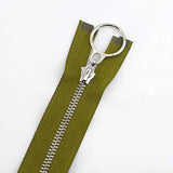
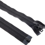

A contrast zip is a zip in a colour deliberately different from the fabric, turning the fastening into a design accent. It works best on visible zips – on sweatshirts, windbreakers, bags and children's clothing – when the colour repeats another detail in the item: piping, print, drawcords or logo. To look considered rather than accidental, the colour is specified exactly, by number from a colour card.
When a contrast zip works
Contrast attracts the eye. So it is suitable when you want the zip to be noticed and to emphasise the line of the item – the vertical of the front, the shape of the pocket or the opening of the bag. It is not suitable when the zip should disappear: on formal dresses, suits and classic trousers it tends to spoil the look.
| Item | Contrast zip | Note |
|---|---|---|
| Sweatshirts and sports tops | Very suitable | Often in the colour of piping or sleeves |
| Windbreakers and jackets | Suitable | Especially on pockets and vents |
| Bags, backpacks, pouches | Very suitable | Can be part of the brand identity |
| Children's clothing | Very suitable | Bright colours, easy-to-find slider |
| Workwear | Suitable | The zip can be in the corporate colour |
| Formalwear | Rarely | Only as a deliberate design move |
How to choose a contrast zip
Repeat a colour from the item
The surest way for a contrast zip to look natural is for its colour to appear somewhere else too: piping, inner lining, hood, drawcords, print, embroidered logo. The eye links the two elements and the zip looks like part of the concept.
Use the colour wheel
- Complementary colours – navy fabric and an orange zip, green fabric and a reddish zip. A strong effect, suitable for sports lines.
- Analogous colours – blue and turquoise, burgundy and pink. A softer contrast, suitable for everyday clothing.
- Neutral fabric and a bright zip – grey, black or beige fabric with a yellow, neon green or red zip. The most common solution.
- Dark fabric and a light zip – a white or ecru zip on navy or black fabric. A classic sporty look.
Think about the slider
With a contrast zip, the slider is clearly visible. Its finish should fit the overall concept: dyed in the colour of the tape for a monochrome accent, matte black for an urban look, nickel colour (nickel free) or bronze for a more classic one. On bags, the puller can be a cord in the colour of the zip.
Types of zips for a contrast effect
- Nylon coil zip – the tape and coil are in one colour, the effect is a clean line of colour. Suitable for sweatshirts, bags, children's clothing. See YKK nylon coil zips.
- Moulded zip – the teeth can be in a different colour from the tape, which allows a double contrast. Typical for sports jackets; see YKK moulded plastic zips.
- Metal zip – a coloured tape with teeth in a metal finish. A more classic, "denim" look.
- Reverse coil zip – only a smooth coloured tape is visible from the outside; a modern minimalist accent.
Common mistakes
- Accidental contrast. The zip is different, but its colour is not repeated anywhere – it looks like an ordering mistake.
- Too many accents. Contrast zip, contrast threads, contrast piping and a large print all at once – the garment becomes noisy.
- Different shades of the "same" colour. The red zip and the red piping come from different suppliers and do not match. Specify everything by number and compare samples.
- A light zip on a fabric that bleeds. After the first wash the white zip turns pink or grey. Check the colour fastness of the fabric.
- The wrong size. If the zip is an accent, a fine No. 3 loses the effect; sometimes No. 5 looks better even on a light top.
Contrast zips and branding
Some brands use the same contrast zip colour across all their styles – it becomes a recognisable sign, like a coloured label or piping. If you plan such an approach, fix the colour number from the YKK colour card as the brand standard, record it in the brand guidelines and use it for all types of zips – coil, moulded, metal. That way the colour stays the same season after season.
How to approve the contrast colour
- Choose 2–3 candidates from the card.
- Place the samples on the fabric and next to the other accent details – piping, print, logo.
- Look at them in daylight and from a distance, as a garment looks on a hanger.
- If possible, order a zip sample and sew it into a prototype.
- Record the approved number in the tech pack.
Contrast in a multi-colour collection
When one style is produced in several fabric colours, there are two strategies. The first is the same contrast zip for all variants – for example a white zip on a navy, black and grey sweatshirt. This simplifies ordering and creates a recognisable look. The second is a separate contrast for each colour – a yellow zip on the grey, orange on the navy. It looks richer but requires more line items, samples and approvals. The decision is both a design and a logistics one; calculate how many zip line items each strategy will generate before choosing it.
Children's clothing: functional contrast
In children's clothing, a contrast zip also has a practical role: the child finds the slider more easily and learns to dress independently. Bright colours, a larger puller and a zip that runs smoothly make the garment more convenient. Follow the safety requirements for children's clothing, including those for hanging cords and pullers.
Advice and ordering
Polkom is a Bulgarian manufacturer of accessories for fashion, furniture, footwear and bags with over 30 years of experience, and also offers original YKK zips. If you want to build a collection with contrast zips, send us samples of the fabrics and accent details – we will suggest numbers from the YKK card and samples for approval.