Manufacturer · Fashion & Home Accessories




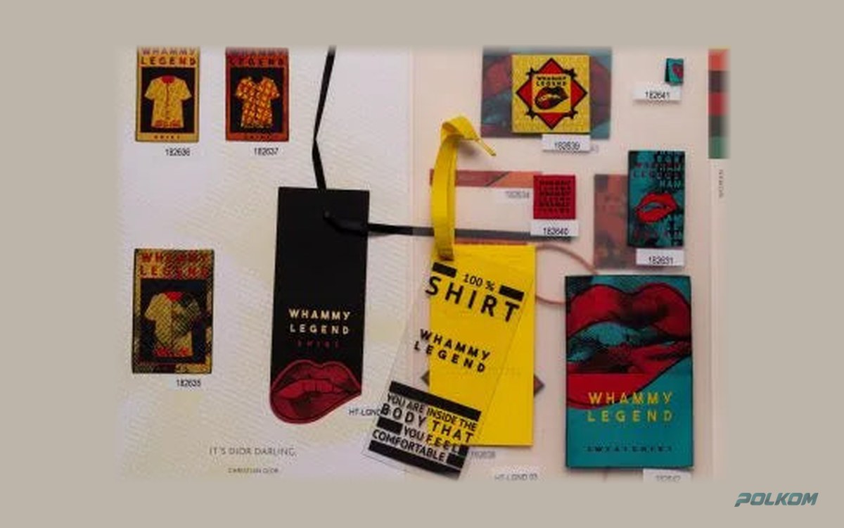
The minimum font size for a woven label depends on the weave: on standard damask, capital letters should be approximately 2–3 mm high to be clearly legible, while on high-definition labels you can go smaller. Taffeta requires even larger text. Thin lines also have a minimum – below a certain thickness they break up or disappear. The values are indicative and are confirmed with a sample.
Minimum font size for woven labels – why there is a limit
A woven label is built from a grid of interlacings – each crossing of a warp thread and a weft thread is one "dot". A letter must fit into a certain number of such dots to remain recognisable. If it is too small, curves turn into steps, the openings of letters such as "e", "a" and "g" close up, and neighbouring letters merge. The finer the threads, the more dots per millimetre and the smaller the text that is possible.
That is why the question "how small can the text be" always has two answers: one for the chosen weave and one for the specific font. The same letter height can be perfectly legible in a semi-bold grotesque and illegible in a thin serif.
Indicative minimums by weave
| Weave | Text | Thin lines | Suitable for |
|---|---|---|---|
| Taffeta | larger text, no fine detail | solid lines only | sizes, simple logos |
| Damask | capitals about 2–3 mm | moderately thin | most brand labels |
| Satin | similar to damask or slightly larger | moderately thin | lingerie, children's clothing |
| HD (high definition) | smaller than damask | thinner | fine text, serif, emblems |
These values are a guide, not a guarantee. The result depends on the font, the colour contrast, the direction of the text and the specific loom.
Which fonts work and which do not
Work well
- Sans-serif fonts with an even stroke weight (grotesques).
- Semi-bold and medium weights.
- Capital letters with sufficient letter spacing.
- Geometric fonts with open forms.
Problematic
- Light and thin weights.
- Serif fonts with high-contrast strokes – the thin parts disappear.
- Script fonts with thin joins between the letters.
- Condensed fonts with very narrow openings.
- Text set as an outline only, without a fill.
Text direction
Detail is not the same in both directions of the weave. The density of warp and weft usually differs, so the vertical and horizontal strokes of the letters are reproduced differently. That is why the technician sometimes suggests rotating the design by 90° relative to the tape or slightly thickening the lines in one direction. These corrections are barely noticeable but improve legibility.
Contrast: the hidden enemy of small text
Small text is harder to read when the contrast is low. Navy on black, grey on white or tone-on-tone combinations look elegant with a large logo but make small text illegible. The rule is: the smaller the text, the stronger the contrast must be. White on black and black on white are the safest combinations.
Thin lines, borders and details
- Borders around the label – a thin border can look broken. Thicken it or remove it.
- Hatching and patterns – very fine patterns turn into a blur. Make them coarser.
- Small ® and ™ symbols – often the smallest element on the label and the first to become illegible. Enlarge them proportionally.
- Full stops and commas – with very small text, punctuation gets lost.
How to check the design yourself
- Print the label at actual size 1:1 on an ordinary printer.
- Look at it from the distance at which a person reads a label – about 30 cm.
- If you have to squint, the text is too small to weave.
- Do the same with a black-and-white version to check the contrast.
What to do if there is too much text
If you want the label to carry a logo, a slogan and a website, and there is not enough space, there are several options:
- Split the information – the logo on the woven label, the website on a printed label or on the hang tag.
- Use a centre fold and put different content on the two sides.
- Increase the size of the label.
- Choose high definition.
When detail is decisive
For very fine emblems, crests and illustrations, a woven label is sometimes not the best carrier. Alternatives are a high-resolution printed label or engraved metal logo plates, which reproduce fine lines excellently. A woven label wins on durability and feel, so often the best solution is a simplified logo on the label and the detailed design on another carrier.
An example of adapting a design
Imagine a logo with the brand name in capitals and below it a slogan in lower case and a website. On a label about two centimetres high, the name reads well, but the slogan and website become illegible. The typical solution is to keep the name, drop the slogan and move the website to the back of a centre-folded label, in a larger font. This keeps the label clean without losing the information.
A sample for small text
On screen everything looks legible, because you can zoom in. A sample is the only reliable test. When you receive it, check the smallest text with the naked eye, in ordinary room light, and compare it with the printed paper version. If something is lost, correct it before the series.
Help from a manufacturer – Polkom
Polkom produces woven labels in various weaves, including high definition. Before sampling, we review the design and tell you which elements should be adjusted. Send an inquiry with the file and the actual size of the label.