Manufacturer · Fashion & Home Accessories






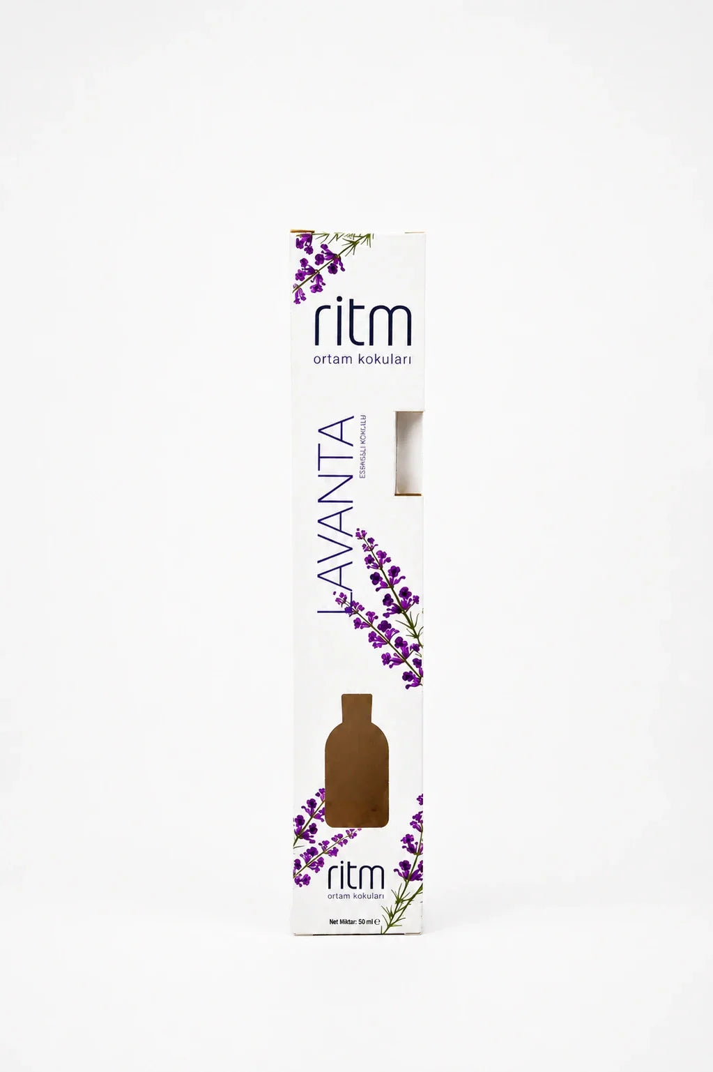
Perfume packaging is not just the box. The customer sees and touches four elements – box, bottle, cap and label – and perceives them as one whole. When they are developed separately, by different people at different times, the result is often inconsistent: the gold of the foil does not match the gold of the cap, and the logo looks different on every surface. The "packaging as a system" approach solves this right from the start.
Perfume packaging: the four elements and the role of each
| Element | Role | Options |
|---|---|---|
| Bottle | Shape and silhouette of the product | Usually chosen first; defines the neck and proportions |
| Cap | Weight, touch, recognisability | Metal or polyester, in any size and shape |
| Metal label | The brand's signature on the glass | Any shape, any metal colour, any logo |
| Box | Protection, information, first impression | Folding or rigid, with insert and finishes |
The order of development matters
The safest route is to define the elements in this order:
- Bottle – the shape and neck determine everything else.
- Cap – designed to fit the neck and silhouette of the bottle.
- Label – its size and shape follow the free area of the bottle and the proportions of the cap.
- Box – sized last, around the bottle with the cap fitted, and repeating the colours and materials already chosen.
If the box is ordered before the cap is final, there is a high risk of changes to the size or insert.
The cap: metal or polyester
Metal cap
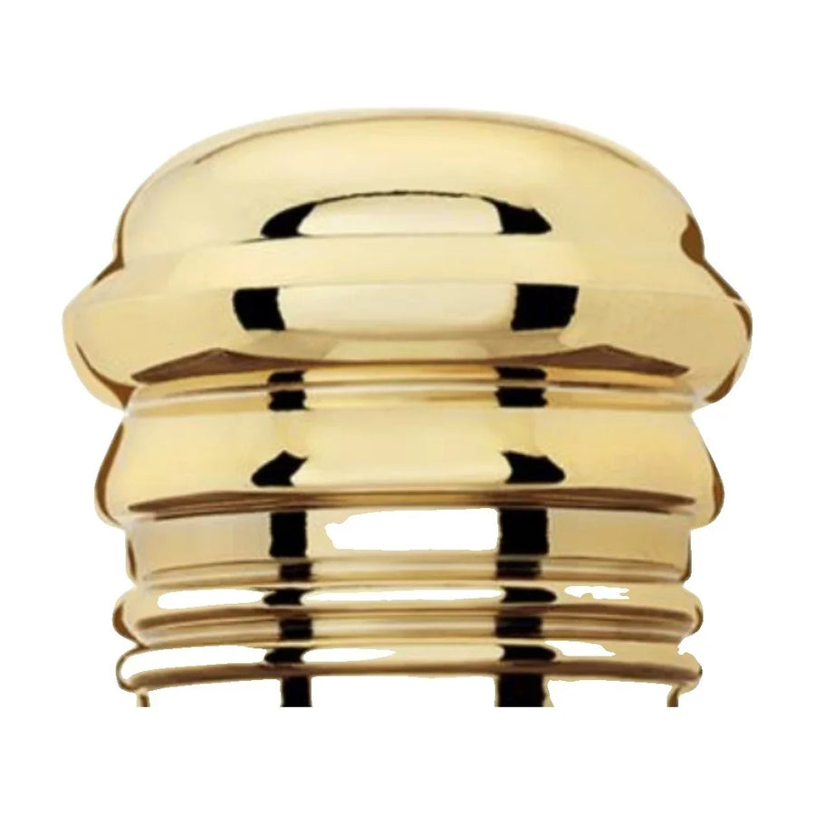
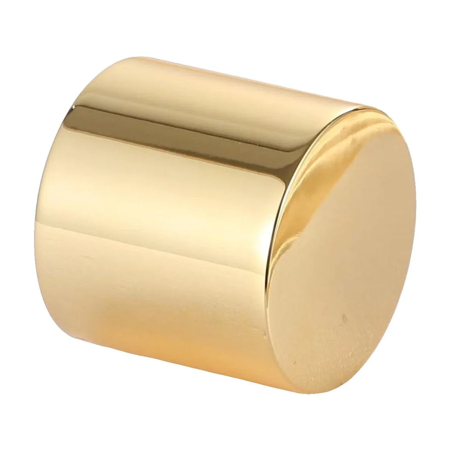
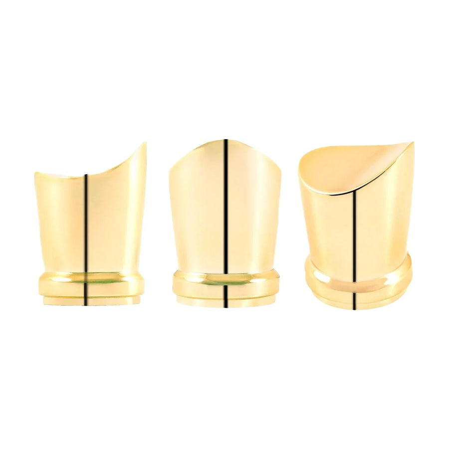
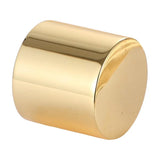
Metal perfume caps give weight, a cool touch and shine. We make them in any size and shape and in any metal colour – gold, light gold, rose gold, silver, nickel, gunmetal, black, antique. All our metal products are nickel free; "nickel" is only the name of the colour. A metal cap naturally pairs with a metal label and foil on the box.
Polyester cap
Polyester caps are made in any Pantone colour – solid, mixed, with a marble effect, matt or glossy. They allow the cap colour to echo the colour of the scent, the liquid or the box. With a marble effect each cap is slightly different, which emphasises the brand's artisanal character.
The metal label – the link between bottle and box
A metal perfume label is a small plate or emblem with the logo, applied to the bottle. The same emblem, in a larger size, can also sit on the lid of the rigid box. That way the customer recognises the brand immediately – on the shelf and after taking out the bottle. The label is made in any metal colour, matching the cap, and with any kind of logo: raised, recessed, engraved, enamelled or printed.
How to coordinate the colours
The hardest part of the system is the same colour on different materials. Gold on metal, gold foil and gold print are never absolutely identical, but they can be in the same tonality.
- Choose a lead tone – for example rose gold on the cap. The box foil and the label are chosen to match it, not the other way round.
- Compare physical samples on one table, under the same light. Photos and screens are misleading.
- With Pantone, bear in mind that the same code looks different on board, in polyester and on glass. Approve each material separately, but side by side.
- The surface is also colour: matt metal next to glossy foil looks like a different tone. Combine gloss with gloss and matt with matt, or make the contrast deliberate.
You can view metal colours and finishes in the perfume accessories category.
One logo, different techniques
The logo will be engraved on the cap, raised on the label and foiled on the box. Each technique has its own limits on line thickness and minimum size. So it is good for the brand to have two versions of the logo: a full one for the box and a simplified one for small surfaces such as the top of the cap. Prepare both in vector format from the start.
Extending the line
The system approach pays off with every new fragrance. The bottle and box construction stay the same, and the new product is distinguished by:
- a different polyester cap colour;
- a different metal colour on the cap and label;
- a change of box or foil colour.
The collection then looks like a family, and developing each next product is faster.
The box as a frame for the bottle
The box should prepare the customer for what they will see inside. A few simple decisions make the connection obvious:
- the box colour repeats the colour of the polyester cap or the liquid;
- the logo foil is in the tone of the metal cap;
- the lid of the rigid box carries the same metal label as the bottle;
- the insert is covered in the brand colour, and the bottle is placed so the cap is visible as soon as the box is opened.
Common mistakes in perfume packaging
- The box is ordered before the cap is final and then does not fit.
- The foil gold is chosen from a catalogue without comparing it to the cap.
- The logo is too detailed for engraving on a small cap.
- The metal label is designed without checking the curvature of the bottle.
- Each element is ordered from a different maker and no one oversees the overall look.
Samples of the whole system
The best way to check the result is a sample of all elements together: the bottle with cap and label fitted, placed in the box insert. Only then can you see whether the proportions, colours and logo work as one whole. Photograph the set in daylight and artificial light and show it to people outside the team – their first impression is closest to that of the customer in the shop. Corrections at this stage are quick, because they affect samples, not a finished run.
Complete perfume packaging from one manufacturer
Polkom is a Bulgarian manufacturer from Sofia with over 30 years of experience – of accessories for fashion, footwear and bags, for perfumes and cosmetics, packaging and furniture accessories. We make caps, metal labels and perfume and cosmetics boxes, so that colours and logo are coordinated from the very beginning and samples are checked together. Send an inquiry with your bottle, logo and idea.